COVID deaths by age group: create & publish your own chart
Cut through all the media b.s. with your own analysis by using CDC's open data
For as much as we distrust the CDC’s pronouncements, they collect a great deal of useful data. Knowing where to find it and how to use it is helpful for independent thinkers and bold decision-makers (such as you and me).
This a lesson in how to use the CDC’s own data to show why 5-14 year olds do not need the COVID vaccine. Most likely, you agree. But with this lesson, you will be able to show it in a way that nobody else is doing.
In this issue, I’ll show you how to easily create your own chart from CDC raw data and publish the chart on the web or post to Facebook. All you need is a Google account. Google is Evil, but they do make working with data very easy.
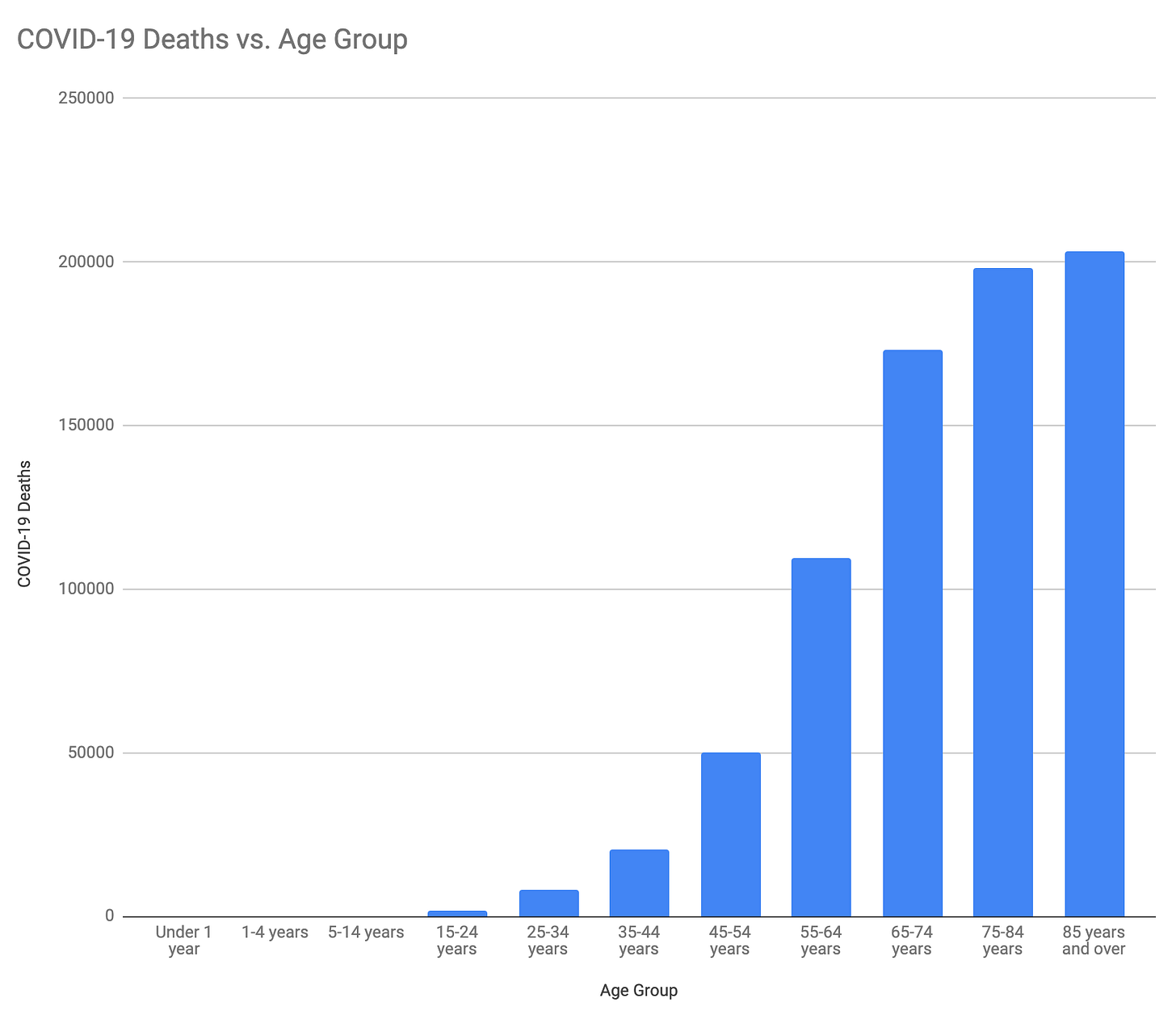
The chart you’ll create looks just like this:
Note that there are some COVID deaths for the youngest age groups, but there are so few that they don’t register on this chart compared to the older groups. I’ll talk more about this below.
You will be amazed at how easy this is. It can be done in just 20 steps that will take less than 30 minutes. Please add any questions and requests about this short lesson to the comments section.


